
[GIS] Uber h3와 kepler.gl을 활용한 공간분석
업데이트:
개요
이번 포스팅은 미국의 승차 공유 서비스(Ride-Hailing Service) 회사인 Uber에서 제공하는 공간분석 도구에 대한 내용이다.
h3라는 python 라이브러리와 공간 정보 시각화 도구인 kepler.gl을 다룰 것이다.
예제 데이터: NYC Taxi trip data
예제로 사용할 데이터는 NYC Taxi trip data로 kaggle에서도 제공하고 있다.
데이터는 다음과 같이 승객들이 택시를 이용한 기록을 담고 있으며, 개별 trip에 대한 승하차 시간 및 위치 정보가 포함된다. 시간적 범위는 2016년 1월 ~ 7월까지의 승차기록을 포함하고 있다.
import pandas as pd

df = pd.read_csv("dataset/"+"sample.csv")
df.head()
| id | vendor_id | pickup_datetime | dropoff_datetime | passenger_count | pickup_longitude | pickup_latitude | dropoff_longitude | dropoff_latitude | store_and_fwd_flag | trip_duration | |
|---|---|---|---|---|---|---|---|---|---|---|---|
| 0 | id1070988 | 2 | 2016-04-11 16:57:11 | 2016-04-11 17:03:37 | 1 | -74.016731 | 40.707352 | -74.015503 | 40.715698 | N | 386 |
| 1 | id3514410 | 2 | 2016-01-11 13:11:53 | 2016-01-11 13:17:08 | 1 | -73.962807 | 40.776661 | -73.979698 | 40.783852 | N | 315 |
| 2 | id0000895 | 1 | 2016-03-13 00:55:15 | 2016-03-13 01:13:56 | 1 | -73.992233 | 40.768879 | -73.920036 | 40.765835 | N | 1121 |
| 3 | id0910784 | 2 | 2016-02-09 08:26:50 | 2016-02-09 08:31:57 | 1 | -73.963531 | 40.765831 | -73.963783 | 40.774368 | N | 307 |
| 4 | id3692103 | 1 | 2016-04-22 00:10:06 | 2016-04-22 00:17:04 | 1 | -73.998665 | 40.739883 | -73.979630 | 40.737106 | N | 418 |
H3 라이브러리
h3는 Uber에서 개발한 Hexagonal Hierarchical Geospatial Indexing System으로, 지구를 계층을 갖는 육각형 그리드로 매핑해 놓은 것이다.
이러한 공간단위를 기반으로 누구나 공간분석에 활용할 수 있도록 오픈소스 형태로 제공하고 있다.
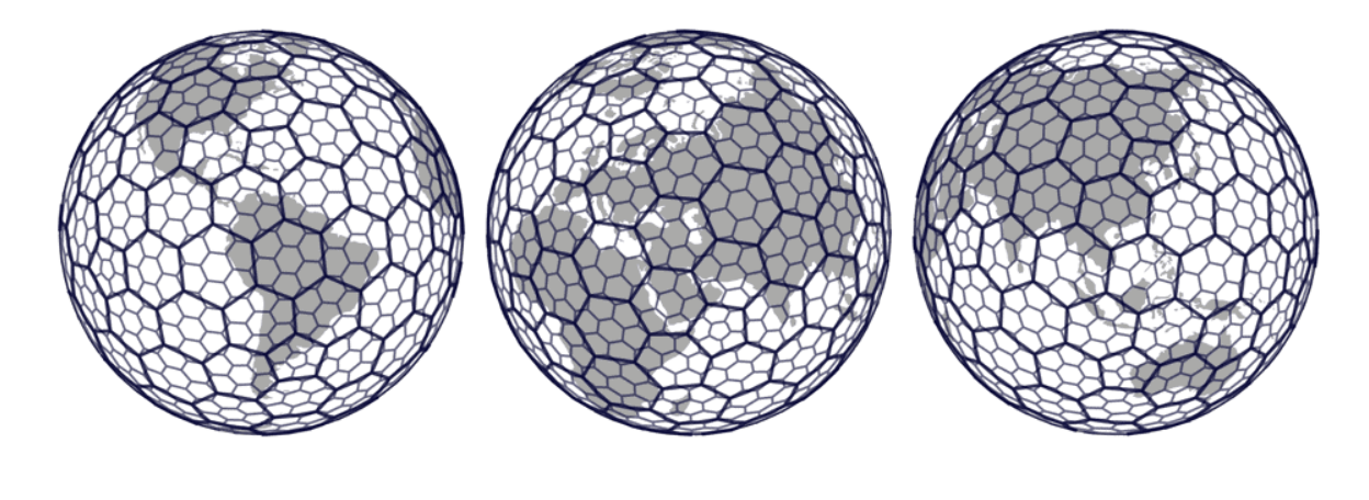
*Source: Uber Tech blog
육각형 그리드(Hexagonal grid)가 갖는 장점은 뭘까?
공간 단위를 사용할 때 인접한 공간은 어디인지?, 공간 간의 거리는 얼마인지? 등을 알 필요가 있다.
아래 그림처럼 육각형 그리드는 정확히 각 6개의 변마다 인접 grid가 존재하며, 각 grid간의 거리는 동일하다.
반면, 삼각형(Triangle)이나 사각형(Square) 같은 경우 인접 grid 간의 거리가 다르게 나타난다.
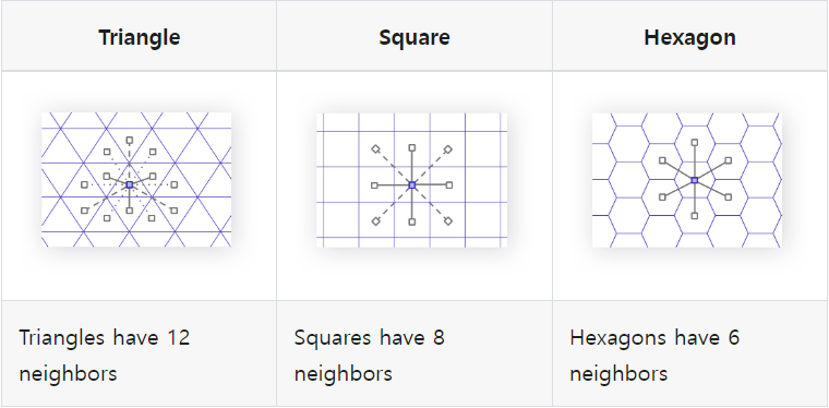
*Source: h3geo.org
h3 Resolution
육각형 그리드는 총 16개의 해상도로 구성된 위계로 이루어져있다.
지구의 모든 면을 육각형 평면으로 표현하기는 어렵기 때문에, 약간의 오각형(Pentagon)이 포함된다.
아래 표는 각 해상도별 육각형 그리드 한 면의 길이를 나타낸다.
개인적으로 resolution=8이 약 461m로 적절하다고 판단하여 사용했던 기억이 난다.
| Res | Average edge length (Km) |
|---|---|
| 0 | 1107.712591 |
| 1 | 418.6760055 |
| 2 | 158.2446558 |
| 3 | 59.81085794 |
| 4 | 22.6063794 |
| 5 | 8.544408276 |
| 6 | 3.229482772 |
| 7 | 1.220629759 |
| 8 | 0.461354684 |
| 9 | 0.174375668 |
| 10 | 0.065907807 |
| 11 | 0.024910561 |
| 12 | 0.009415526 |
| 13 | 0.003559893 |
| 14 | 0.001348575 |
| 15 | 0.000509713 |
h3 설치
이제 본격적으로 h3를 사용해보자. 설치는 아래와 같이 간단하다.
공식 document는 h3geo.org에서 확인할 수 있다.
본 포스팅에서 진행한 예제의 source code는 github에서 확인할 수 있다.
$ pip install h3
설치를 완료했으면, 앞으로의 예제에 필요한 라이브러리들을 불러온다.
import h3
import pandas as pd
import numpy as np
import geopandas as gpd
from shapely.geometry import Polygon, Point, mapping
from shapely.ops import unary_union
from fiona.crs import from_string
epsg4326 = from_string("+proj=longlat +ellps=WGS84 +datum=WGS84 +no_defs")

import matplotlib.pyplot as plt
h3 basic function
먼저 택시 데이터에서 sample point하나만 가져오고, 해상도(resolution)는 8로 설정하자.
h3 mapping 시에는 latitude(y), longitude(x) 순으로 입력되어야 한다.
하지만 우리가 지도에 뿌리거나 시각화 할때는 다시 x,y순으로 바꿔주어야 하는 것을 기억해야한다.
point = df.iloc[0][["pickup_latitude","pickup_longitude"]].values
res = 8
h3.geo_to_h3: 좌표를 h3 index로 변환
h3는 아래와 같이 고유한 index ID를 갖고 있다. 또한 변환 할 geo 좌표는 EPSG4326인 위경도 좌표이어야 한다.
point_h3 = h3.geo_to_h3(point[0], point[1], res)
print(point_h3)
882a1008b3fffff
h3.h3_to_geo_boundary: h3의 boundary 좌표 출력
변환된 h3 index의 가장자리 geo 좌표를 가져온다. 이를 통해 우리는 육각형 그리드의 실체(?)를 볼 수 있다.
geo_json=True로 두면, 다시 x,y좌표의 순서를 바꾸는 불편함을 겪지않도록 교체헤서 출력해준다.
h3_bnd = h3.h3_to_geo_boundary(point_h3, geo_json=True)
print(h3_bnd)
((-73.98458981348507, 40.77551579030846), (-73.99097256583582, 40.77446168130402), (-73.99293836780527, 40.77000081157416), (-73.98852232840895, 40.766594382212254), (-73.98214060271079, 40.76764827116326), (-73.98017388986867, 40.77210880949959), (-73.98458981348507, 40.77551579030846))
h3.h3_to_geo: h3의 중심(centroid) 좌표 출력
h3_point = h3.h3_to_geo(point_h3)
print(h3_point)
(40.77105498201156, -73.98655625625548)
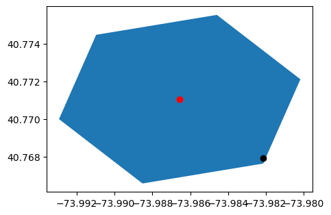
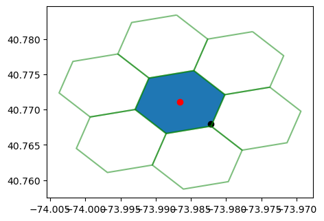
위 3가지 출력을 geopandas를 기반으로 시각화해보면 아래와 같다.
원래 sample point(검정)로부터 h3 grid(파랑)를 가져왔고, 그에 해당하는 중심좌표(빨강)를 출력하였다.
ax = gpd.GeoSeries(Polygon(h3_bnd)).plot(figsize=(5,5))
gpd.GeoSeries(Point(h3_point[1], h3_point[0])).plot(ax=ax, color='red')
gpd.GeoSeries(Point(point[1], point[0])).plot(ax=ax, color='black')
plt.show()
to_polygon함수 생성
위에서 plot한것 처럼 h3_to_geo_boundary를 통해 Polygon을 만들었다.
이를 아래와 같이 함수로 저장해놓고 사용하면 간편하다.
def to_polygon(l):
    return Polygon(h3.h3_to_geo_boundary(l, geo_json=True))
h3.k_ring: h3의 neighbor h3들 가져오기
해당 h3 index를 포함하고, 인접해있는 h3들로 총 7개를 가져온다.
neighbor_h3 = h3.k_ring(point_h3)
print(neighbor_h3)
{'882a1008b7fffff', '882a100d65fffff',
'882a100d6dfffff', '882a1008b1fffff',
'882a107259fffff', '882a1008bbfffff',
'882a1008b3fffff'}
이를 다시 시각화해보면 아래와 같다.
ax = gpd.GeoSeries(Polygon(h3_bnd)).plot(figsize=(5,5))
for h in neighbor_h3:
    gpd.GeoSeries(to_polygon(h).boundary).plot(ax=ax, color='green', alpha=.5)
gpd.GeoSeries(Point(h3_point[1],h3_point[0])).plot(ax=ax, color='red')
gpd.GeoSeries(Point(point[1], point[0])).plot(ax=ax, color='black')
plt.show()
h3.h3_indexes_are_neighbors: neighbor h3인지 판단하기
위에서 만든 neighbors를 가지고 확인해보면, 같은 h3를 제외하고는 True값을 반환하는 것을 알 수 있다.
for h in neighbor_h3:
    cond = h3.h3_indexes_are_neighbors(point_h3, h)
    print(h,cond)
882a1008b7fffff True
882a100d65fffff True
882a100d6dfffff True
882a1008b1fffff True
882a107259fffff True
882a1008bbfffff True
882a1008b3fffff False
h3.h3_distance: h3 index간의 거리(칸) 계산
point2 = df.iloc[1][["pickup_latitude","pickup_longitude"]].values
point2_h3 = h3.geo_to_h3(point2[0], point2[1], res)
point2_h3_bnd = h3.h3_to_geo_boundary(point2_h3)

distance = h3.h3_distance(point_h3,point2_h3)
print(distance)
4
h3.k_ring_distance: k내 거리에 있는 h3 index를 반환
k=1로 하면 h3.k_ring과 동일하게 본인과 neighbor h3들을 반환한다. 차이점은 아라왜 같이 위계를 유지한 상태로 list에 담아준다.
k_h3 = h3.k_ring_distances(point_h3,1)
print(k_h3)
[{'882a1008b3fffff'},
{'882a1008b7fffff', '882a100d65fffff', '882a100d6dfffff', '882a1008b1fffff', '882a107259fffff', '882a1008bbfffff'}]
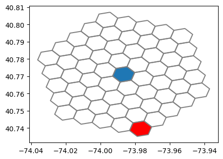
이를 이용해서 h3.h3_distance로 구한 거리가 정말 4만큼 떨어져 있는지 확인해보자.
k_h3_6 = h3.k_ring_distances(point_h3,4)
print(len(k_h3_6))

gs = []
for hier in k_h3_6:
    for h in hier:
        gs.append(to_polygon(h))
5
ax = gpd.GeoSeries(Polygon(h3_bnd)).plot(figsize=(5,5))
gpd.GeoSeries(gs).boundary.plot(ax=ax, color='grey')
gpd.GeoSeries(point2_h3_bnd).plot(ax=ax, color='red')
plt.show()
h3.polyfill function
h3.polyfill: polygon 내부를 grid로 채우기
이 함수는 hexagonal grid로 구성된 basemap을 만들때 자주 사용된다.
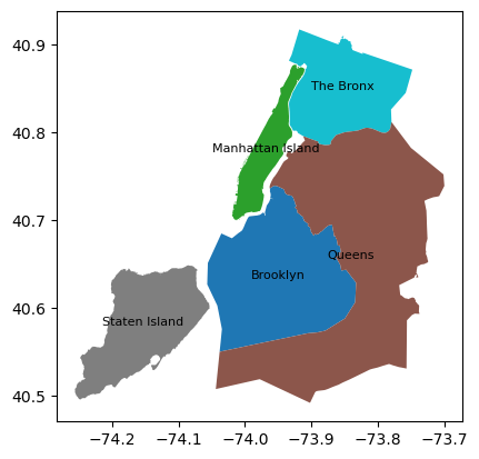
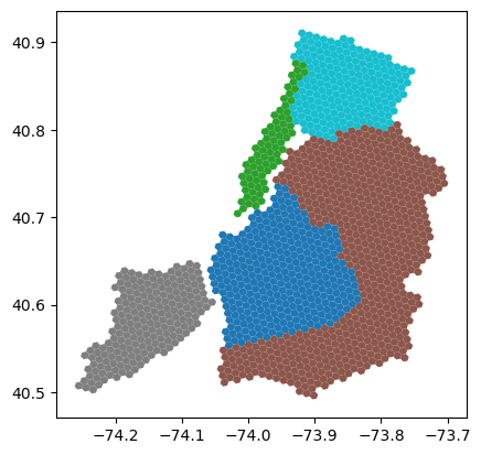
예시를 위해 open street map에서 New York시의 boundary를 약간 전처리해서 가져왔다. 총 4개의 자치구로 구성되어 있다.
nyc_bnd = gpd.GeoDataFrame.from_file("C:/Users/syg/Desktop/nyc_h3/newyork_bnd.shp")
ax = nyc_bnd.plot(column='name')
for idx, row in nyc_bnd.iterrows():
    ax.annotate(text=row['name'], xy=row['geometry'].centroid.coords[0],
                 horizontalalignment='center', fontsize=8)
plt.show()
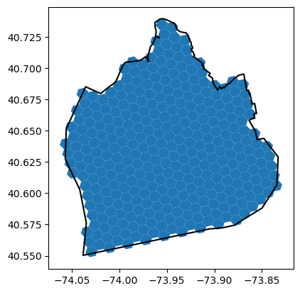
이중 브루클린 지역에 hexagonal grid를 깔아보자.
h3.polyfill은 geojson 형태를 input으로 받기 때문에, mapping을 이용해서 geometry를 geojson 형태로 만들어준다.
그리고 다시 y,x 좌표 순서로 바꿔준 후 입력한다(이건 좀 귀찮다).
resolution=8로 생성된 브루클린 지역의 그리드들은 총 340개가 생성된다.
brooklyn = nyc_bnd[nyc_bnd["name"]=="Brooklyn"]

g = mapping(brooklyn["geometry"].iloc[0])
g['coordinates'] = [[[j[1],j[0]] for j in i] for i in g['coordinates']]
hex_list = h3.polyfill(g,res=res)

print("*Resointion :",res)
print("*Number of hex :",len(hex_list))
*Resointion : 8
*Number of hex : 340
시각화 해보면 아래와 같다.
br_hex = pd.DataFrame(hex_list,columns=["hex_id"])
br_hex['geometry'] = br_hex["hex_id"].apply(lambda x : to_polygon(x))
br_hex = gpd.GeoDataFrame(br_hex, geometry='geometry', crs=epsg4326)

ax = br_hex.plot()
brooklyn.boundary.plot(ax=ax, color='black')
plt.show()
모든 자치구에 적용해보면 아래와 같은 결과를 뽑을 수 있다.
nyc_hex=gpd.GeoDataFrame()
for r in nyc_bnd.iterrows():
    name = r[1]["name"]
    geom = r[1]["geometry"]
    g = mapping(geom)
    g['coordinates'] = [[[j[1],j[0]] for j in i] for i in g['coordinates']]

    sub_df = gpd.GeoDataFrame({"name":name,
                               "hex_id":list(h3.polyfill(g,res=res))})
    nyc_hex = nyc_hex.append(sub_df, ignore_index=True)
    print(name,":",len(sub_df))
print("*Total:", len(nyc_hex))
The Bronx : 202
Brooklyn : 340
Queens : 627
Staten Island : 203
Manhattan Island : 74
*Total: 1446
nyc_hex['geometry'] = nyc_hex["hex_id"].apply(lambda x : to_polygon(x))
nyc_hex = gpd.GeoDataFrame(nyc_hex, geometry='geometry', crs=epsg4326)

nyc_hex.plot(column="name")
plt.show()
h3를 활용한 맨하탄 택시수요 시각화
이제 모든 데이터를 h3에 매핑해서 택시 수요를 시각화해보자.
- Basemap 만들기
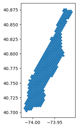
우선 h3.polyfill을 이용해 basemap을 만들어주자. 택시수요가 거의 밀집되어 있는, 맨하탄에 집중해보자.
맨하탄이 작기 때문에 해상도(resolution=9)를 늘려서 다시 생성한다.
res2 = 9
manhattan = nyc_bnd[nyc_bnd["name"]=="Manhattan Island"]

g = mapping(manhattan["geometry"].iloc[0])
g['coordinates'] = [[[j[1],j[0]] for j in i] for i in g['coordinates']]
manhattan_hex = gpd.GeoDataFrame({"hex_id":list(h3.polyfill(g,res=res2))}, crs=epsg4326)
manhattan_hex['geometry'] = manhattan_hex["hex_id"].apply(lambda x : to_polygon(x))
manhattan_hex = manhattan_hex.set_geometry("geometry")

print("*Resointion :",res2)
print("*Number of hex :",len(manhattan_hex))
*Resointion : 9
*Number of hex : 523
manhattan_hex.plot()
- raw 데이터 h3 index 매핑하기
아래와 같이 승차(start_h3)와 하차(dest_h3) 위경도 좌표를 각각 h3 index로 매핑한다.
df["start_h3"] = df.apply(lambda x: h3.geo_to_h3(x['pickup_latitude'], x['pickup_longitude'], res), axis=1)
df["dest_h3"] = df.apply(lambda x: h3.geo_to_h3(x['dropoff_latitude'], x['dropoff_longitude'], res), axis=1)

print("Total start_h3:", len(df["start_h3"].unique()))
print("Total dest_h3:", len(df["dest_h3"].unique()))
Total start_h3: 286
Total dest_h3: 611
- datetime 변수 추출하기
승차시간을 기준으로 평일 여부와 시간대를 출근(AM_peak), 퇴근(PM_peak), 그 외(Non_peak)로 이루어진 categorical 변수로 나누었다.
df["pickup_datetime"] = pd.to_datetime(df["pickup_datetime"])
df["dropoff_datetime"] = pd.to_datetime(df["dropoff_datetime"])

df["pk_month"] = df["pickup_datetime"].dt.month
df["pk_hour"] = df["pickup_datetime"].dt.hour
df["dayofweek"] = df["pickup_datetime"].dt.weekday

df["weekend"] = np.where(df["dayofweek"]<=4,0,1)
df["pk_hour_cat"] = np.where((df["pk_hour"] >= 7) & (df["pk_hour"] <= 10), "AM_peak",
                             np.where((df["pk_hour"] >= 17) & (df["pk_hour"] <= 20), "PM_peak","Non_peak"))
- h3 index로 집계(count)하기
이제 평일, 시간대별 맨해튼의 수요를 시각화하면 아래와 같다.
스케일링은 굳이 진행하진 않았다.
plt.figure(figsize=(10,4))
n=1
for m in ["AM_peak","PM_peak","Non_peak"]:
    sub_df = df[(df["pk_hour_cat"]==m) & (df["weekend"]==1)]
    sub_df = sub_df.groupby("start_h3").size().reset_index(name="cnt")
    result = manhattan_hex.merge(sub_df.rename({"start_h3":"hex_id"},axis=1), how='left', on="hex_id")
    result["cnt"] = result["cnt"].fillna(0)

    ax = plt.subplot(1,3,n)
    ax.set_axis_off()
    plt.title(m)
    a = result.plot(ax=ax,column='cnt', cmap='coolwarm', legend=True)
    n+=1
plt.tight_layout()
plt.show()
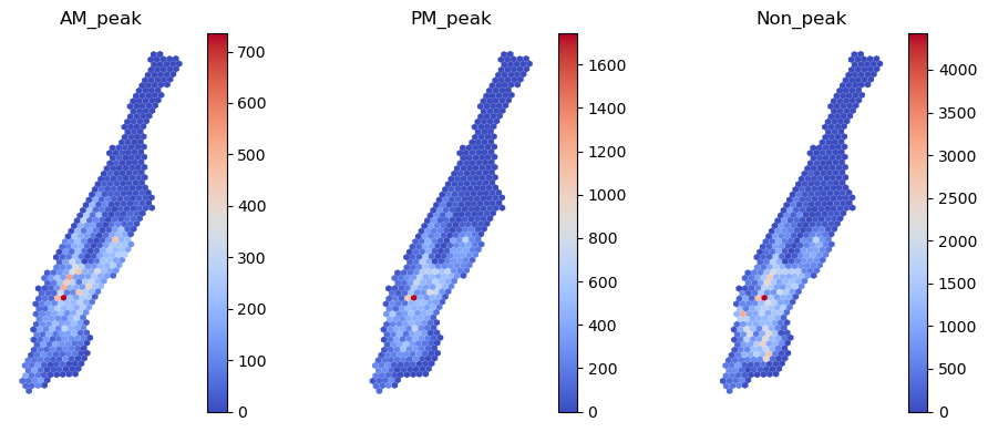
- 전반적으로
AM_peak는 비교적 넓게,PM_peak는 수요가 한쪽에 집중되는 것으로 보인다. 해당 지역은 엠파이어 스테이트 빌딩이 위치하고 있는 상업지구이다. - 미국의 토지이용은 잘 모르지만, 해당 지역 부근에서 퇴근하는 사람이 많을 것이다.
- 북쪽 지역은 지도를 보니 Harlem이 위치하고 있는데, 택시 수요가 거의 없는 것 같다.
Non_peak는 절대적으로 시간대가 많기 때문에 수요가 가장 많이 분포한다.
더 자세한 분석은 추후 문제를 푸는 과정에서 진행할 예정이다.
kepler.gl: 공간 시각화 도구
kepler.gl는 Uber에서 만든 공간 정보 시각화 Tool이다. QGIS 보다 자율성(?)은 떨어지지만, 다양한 시각화 방법을 담고 있으며 graphical하게 꽤나 세련되었다.
또한 앞에서 다룬 h3 index도 이 Tool에 녹아있어서 같이 사용하면 매우 편하고 유용하다.
시작하기
일단 실행하는 방법은 3가지 정도가 있는데 매우 간단하다.
- online에서 사용하기
위 Link를 타고 들어가서 GET STARTED를 이용하면, 바로 사용 가능하다.
- VS Code Extension
VS Code에서 Extension으로 Geo Data Viewer를 검색하고 설치한다.
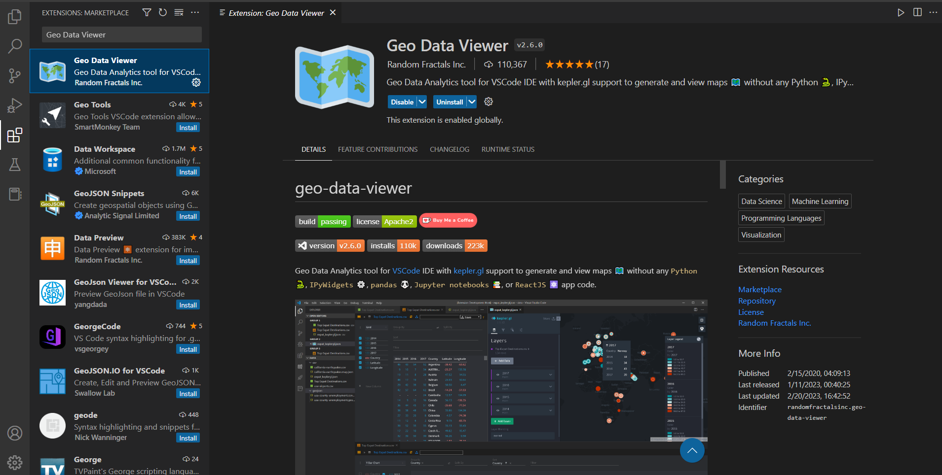
실행은 VS code의 Show all commands(Ctrl+Shift+p)에서 Geo: View Map을 선택하면 바로 실행된다.
현재 이걸 사용중이다.
- Jupyter notebook에서 불러오기
이 경우에는 설치를 해야하는데, 필요한 것들은 아래와 같다.
- keplergl
- jupyter lab (설치가 안돼 있을 경우)
- nodejs
- jupyter labextension
아래와 같이 각각 설치하면 된다.
$ conda activate myenv
$ pip install keplergl
$ conda install jupyterlab
$ conda install nodejs
$ jupyter labextension install @jupyter-widgets/jupyterlab-manager keplergl-jupyter
이제 jupyter notebook에서 아래와 같이 실행할 수 있다.
map을 불러오면 folium과 같이 동적인 지도가 생성되는데, add_data를 통해 데이터를 주입시켜주면 된다.
자세한 내용은 아래 같이 표기된 User Guide를 참고하자.
import pandas as pd
from keplergl import KeplerGl

sample = pd.read_csv("dataset/sample.csv")
map_1 = KeplerGl(height=500)
map_1.add_data(sample)
map_1
User Guide: https://docs.kepler.gl/docs/keplergl-jupyter
다양한 시각화 방법
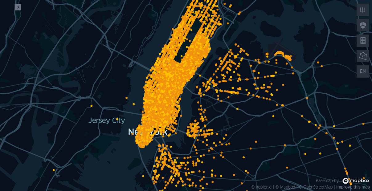
예제 데이터를 다양하게 시각화 해보자. 데이터가 너무 크면 무거워서 조금만 샘플링을 하였다.
실행 후 Add Data를 클릭해서, 데이터를 불러와서 이것저것 만져보면 금방 따라할 수 있다.
좌측 탭에 대한 간단한 설명은 아래와 같다.
- Basic
- 시각화 방법(현재는 h3)과 좌표값 속성을 지정
- Color
- 색상을 표시할 변수(column) 지정
- 색상 정보 변경 (RGB color)
- 집계 방식 (average, count, sum 등)
- Radius
- Hexagon의 size를 결정(집계단위의 변경)
- Height
- 집계된 값에 대해 가중치를 둬서 3D map으로 표현
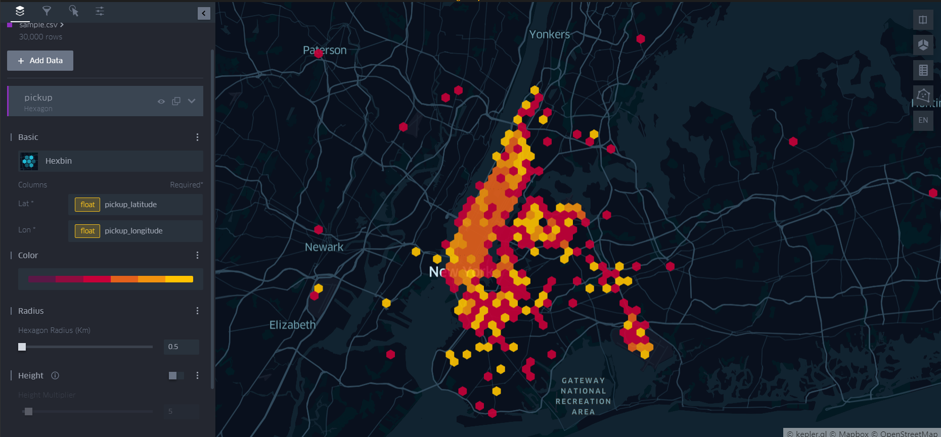
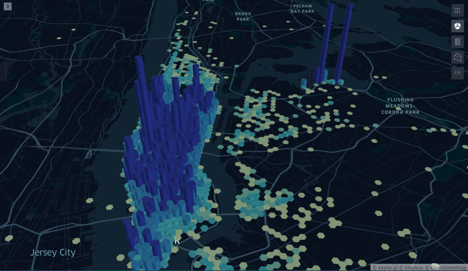
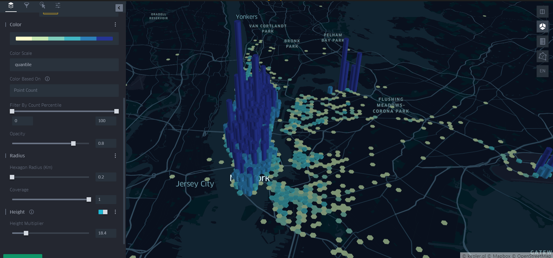
- Hexagon 기반 3D 시각화
옵션들을 아래 그림과 같이 조정해서 앞서 h3 라이브러리로 진행했던 내용을 시각화해보았다(물론 시간대 등에 따라 필터링은 안되어 있다).
3D로 보기 위해서는 우측 탭의 2번째 아이콘을 잡아줘야한다.
- 시간적(Temporal) 특성 시각화
좌측 상단의 두번째 탭(Filters)을 클릭하면 속성별로 filter를 할 수 있는 기능이 있다.
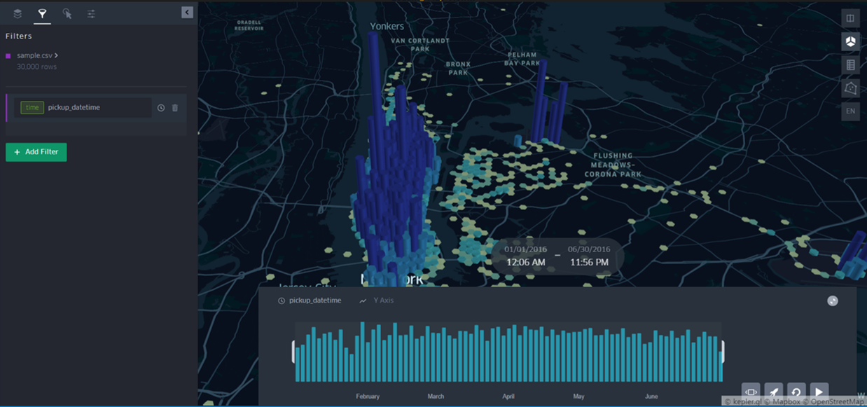
승차시간과 같은 시간 변수를 지정해주면, 자유롭게 시간대를 나눠서 볼 수 있고 애니메이션 형태로 관찰할 수도 있다. 개인적으로 이 기능이 좋다.

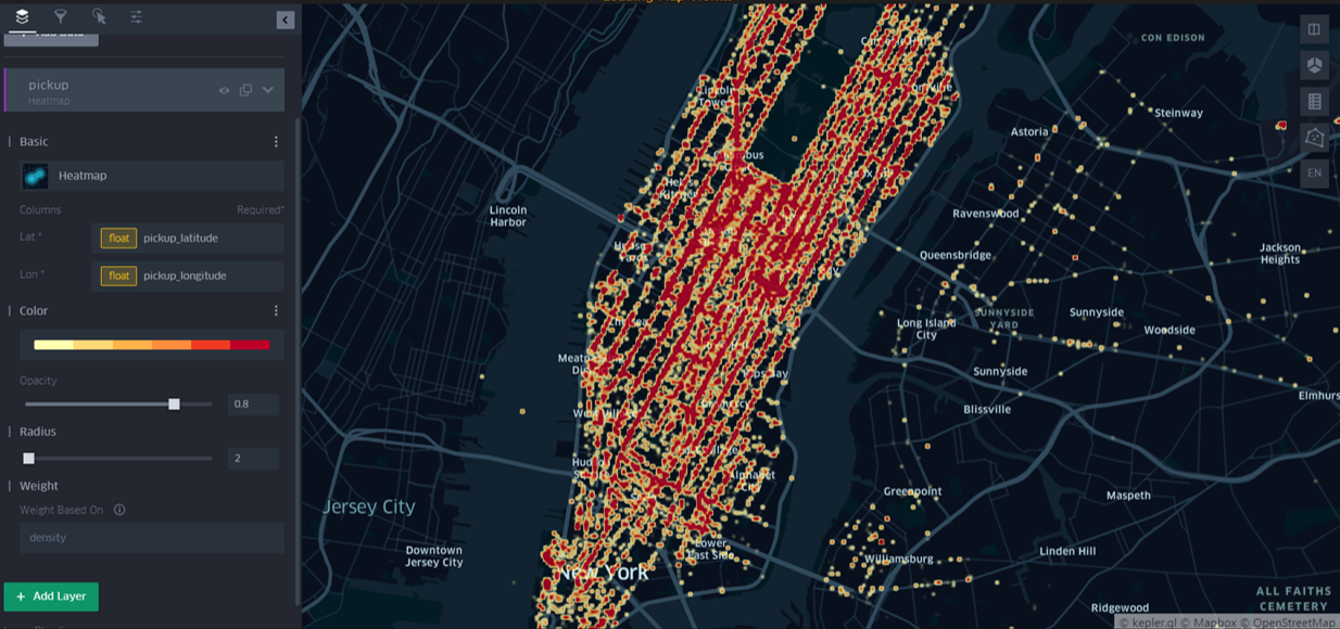
- Heatmap을 이용한 시각화
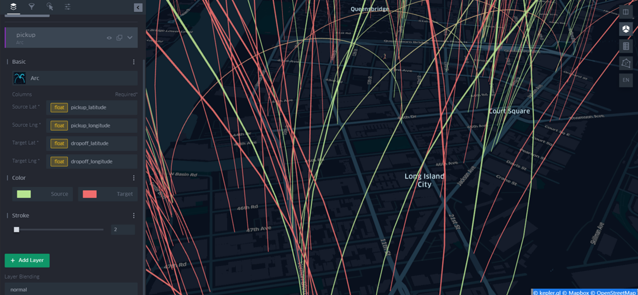
- Arc를 이용한 OD(Origin-Destination) 시각화
Arc라는 시각화 타입이 있는데 승하차 위치와 같이 OD가 존재하는 데이터의 경우 유용하게 시각화가 가능하다.
아래 그림과 같이 Source(출발지)와 Target(도착지) 좌표를 입력해주면, 데이터 하나하나 마다 Arc를 이용해 시각화해준다. Source는 연두색, Target은 빨간색으로 나타난다.
데이터가 많아서 가시적이진 않지만, 잘쓰면 유용할거 같다.
이 밖에도 다양한 시각화 방법이 존재하는데, 하나씩 시각화해보면 크게 어렵지 않게 활용이 가능하다.
Reference
https://h3geo.org/docs/
http://incredible.ai/code-snippet/2019/03/16/Uber-H3/
https://kepler.gl/

댓글남기기